
Not too long ago at home, offspring and I revisited an old cinematic friend (to be completely accurate, “old” for me; brand new for her): Stanley Kubrick’s brilliant take on the Stephen King novel, “The Shining”.
Afterwards, I found myself wondering what the movie’s dirge-like opening music is as Jack Nicholson’s character, Jack Torrance, is wheeling his Volkswagen up a winding mountain road to reach the story’s centrepiece, the Overlook Hotel. The sequence is exceedingly unsettling, the more so because the music, which is so loaded with foreboding, plays in jarring juxtaposition to some of the most stunning visual scenery ever committed to celluloid.
A very short Google search led me to this wonderful essay, which not only identifies the opening music as “Dies Irae” (“Day of Wrath”), it also makes a strong argument to suggest the movie is really about white North American society’s trampling all over the continent’s first nations. I know; I can hear the “Oh give me a break!” choruses already, but this is not the work of some overly idealistic second-year film student. Author Bill Blakemore is a long-time journalist whose current specialization is the environment. His ABC news biography sums up his career this way:
“stories of conflict and politics, the arts, nature and science -- and now global warming and other narratives involving the love-hate relationship between nature and man.”
Hardly surprising, then, that someone like him should find in “The Shining” some strong links to suggest that, for Stanley Kubrick, King’s novel might well have been the launch pad for a subtle lament for the Noble Savage.
Any “hidden meaning” aside, I had forgotten much that I loved about this movie – including its visuals. In “The Shining”, Kubrick plays very successfully with several opposites. I’ve already mentioned the ominous opening music playing over scenes of placid beauty. But Kubrick also makes his film’s images work against its own storyline. It is the story of a man’s descent into an insanity so complete that, late in the movie, the sheer force of how far gone he is insinuates itself into his wife’s mind and she also sees several disturbing visions in her own frantic search for their son.
But visually, in sharp contrast to the wild departure from reality the two principal characters suffer, Kubrick gives us image after image that is absolutely rock solid. His shots are often square-on, with a character hammered exactly into the centre of the scene, often surrounded by several powerful framing supports – a tapestry on the wall in the background, the top and bottom boundaries of that wall, even the leading-line boundaries of the same room’s side walls work to draw your eye immediately to the character’s position in screen centre. One gets the distinct feeling that this hotel, despite its shifting psychological bedrock of horror, is a structure that physically will last until the end of time.
As an aside, there is a brief “shock” scene where the Nicholson character erupts from one side of the picture while taking a wide sweeping swing of an axe. In one of those moments of cosmic unity, offspring was stretched out on a couch and at that very moment one of our two cats, in hot pursuit of a moth, leapt with no warning at all onto her chest. Based on her explosive reaction, this is one movie offspring won’t soon forget.
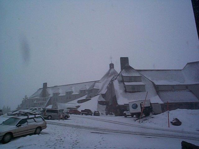
And as a Trivia PS, this is the property that served as the setting for all the exterior shots, the Timberline Lodge on Mount Hood, Oregon.
I don’t think I’ll be visiting it anytime soon. I mean, after all, there are bodies of the recently slain and skeletons of the more distantly deceased all over the place; the elevators spew rivers of blood and it seems it’s built on the graves of some late natives who are now grievously offended spirits.
Right?
= = =
I have some gripes about grammar.
Now I know there is a risk in opening up with the sentence, “I have some gripes about grammar”. Because no doubt I have also assembled a great many sentences and phrases in my years here which, ratio-wise, are to “models of grammatical correctness” what Paris Hilton is to “demure”. In fact, a case could easily be made that I long ago abrogated any right to complain about other people’s grammar. Nonetheless, I have some gripes about grammar when it is misused by people who really should know better. And if not the authors, then certainly their editors – where they exist – should know better.
For example, I am currently reading a thoroughly enjoyable book about the Royal Navy and their precursors, England’s merchant sailors and explorers, and how they defined much of the world’s present day geopolitics. (“To Rule the Waves: How the British Navy Shaped the Modern World”, by Arthur Herman) It includes one of the most readable and flat-out exciting descriptions I’ve ever read of the Battle of Trafalgar but, in one of the run-up encounters leading to that battle, Nelson is described as “pouring over his maps”. One hopes they were waterproof.
- - -
In a recent article in the Vancouver Sun, the status of literacy training for immigrants to British Columbia is described thusly: “British Columbia has consistently offered the lowest levels of literacy training for adult refugees than anywhere else in the country.” Comparative vs superlative folks. You can be described as “lowest… in the country” or “lower… than anywhere else in the country”, NOT “lowest… than anywhere else”.
- - -
This, from a recent article in The Financial Post, from a labour lawyer who is also the editor-in-chief, no less, of The Dismissal and Employment Law Digest:
"Rather than dramatically increasing their wage loads by paying overtime, employers will hire less employees and contract out more work."
(Actually, this one probably is a little more subtle. It’s here because the misuse of “less” vs “fewer”, when comparing quantity vs numbers, is a family pet peeve and a deliberate trigger we use to get a rise from each other at the dinner table. You can “make fewer errors by writing less material”. You can’t “make less errors by writing fewer material”.)
- - -
This is a bit of a “golden oldie”: McGrath is a collection agency here in Ottawa that is pretty well the first – if not the only – name that comes to mind when a company wants to contract for collection services that don’t involve some guy named Guido collecting from behind the barrel of a shotgun. A while back, they spent a fortune on transit ads that adorned the sides and backs of dozens of the city’s buses, shouting for all the world to see that this company is, “The Name to Know to Collect Your Doe”.
Deer me, I hope the ads didn’t reduce the number of bucks they earned.
- - -
On a recent drive through the City of Ottawa, I found myself at a traffic light sitting next to a brand new, bright red, costing-many-tens-of-thousands pick-up truck that a General Contractor has obviously chosen not only as the vehicle of choice to get his material to the job site, but also as a rolling billboard to promote his services. Emblazoned across the full width of his tailgate in huge letters was this slogan: “Quality At It’s Finest”.
The use and misuse of the apostrophe in “its” is among the most common of the written English world’s grammatical errors, but it’s (it is) included here because of the unintended hilarity occasioned by the particular message in which its (possessive) misuse appears.
- - -
And here’s another in the “They really oughta know better” series. This headline opened a news release I received not so long ago from Canadian Press:
“Edmontonians offering to open there doors to a group of homeless Eskimos.”
- - -
Sesame Street sing-along time!: “Who are the people in your neighbourhood? In your neighbourhood, in your neigh-bour-hooo-ood. Who are the people in your neighbourhood? The people that you meet, as you’re walking down the street; the people that you meet each day?”
Well, in our neighbourhood, they include people who have decided that a six-foot-high fountain on their front lawn is not gaudy enough all by itself, and really needs a little something extra. So they added a lime green floodlight that, after dark, makes it look radioactive.

And no, this image has not been colour altered in the camera or in its subsequent reproduction here. (It’s a little fuzzy because I shot it sans flash, so the shutter was opened for the better part of a second.) This is precisely the popsicle green you see as you approach it from the front. And as if that weren’t enough to draw the neighbourhood’s after-sundown attention to the new “lawn friend”, another spotlight throws a brilliant red light on its back (house) side. The spectral collision that assaults your retinas as you walk past it from one side or the other is something to experience. Kind of like getting too much wasabe with your sushi.
À la next time.
ray ban sunglasses, louboutin, oakley sunglasses, nike free, kate spade outlet, air max, michael kors, longchamp outlet, louis vuitton outlet, louboutin outlet, nike free, longchamp outlet, air jordan pas cher, ugg boots, tiffany and co, nike outlet, sac longchamp, tory burch outlet, nike air max, louis vuitton, longchamp pas cher, polo ralph lauren outlet, oakley sunglasses, jordan shoes, replica watches, uggs on sale, louboutin shoes, ray ban sunglasses, prada handbags, ugg boots, oakley sunglasses, louis vuitton, tiffany jewelry, oakley sunglasses, louboutin pas cher, christian louboutin outlet, replica watches, polo ralph lauren outlet, burberry, nike roshe run, nike air max, ray ban sunglasses, chanel handbags, cheap oakley sunglasses, louis vuitton outlet, prada outlet, louis vuitton, gucci outlet, longchamp, ralph lauren pas cher
ReplyDeletelululemon, kate spade handbags, michael kors outlet, replica handbags, hermes, michael kors, ray ban pas cher, tn pas cher, nike blazer, burberry outlet online, nike free run uk, true religion outlet, timberland, vanessa bruno, ralph lauren uk, new balance pas cher, michael kors, burberry, ray ban uk, coach outlet, true religion jeans, hollister pas cher, north face, oakley pas cher, air force, ugg boots, true religion jeans, abercrombie and fitch, nike roshe, sac guess, vans pas cher, lacoste pas cher, mulberry, coach purses, coach outlet, true religion jeans, michael kors outlet, michael kors outlet, michael kors outlet, michael kors outlet, michael kors, nike air max, hogan, converse pas cher, nike air max, hollister, ugg boots, north face, michael kors, nike air max
ReplyDelete